


The idea for Windows 100 came from Graeco-
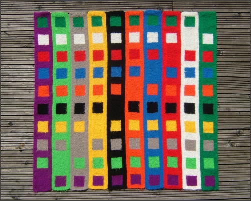
The ten colours were purple, green, beige, yellow, black, orange, blue, red, white and turquoise. These colours were not specially chosen. We had decided it would be nice to soften the edges of the squares by using a slightly fluffy yarn and happened to have sufficient yarn in these ten colours. The design would have worked equally well in any ten colours provided that they were easily distinguishable.
Each colour would be at the centre of ten squares, each of which had a border of a different colour. For example, yellow would be at the centre of ten squares and would be surrounded by purple, green, beige, yellow, black, orange, blue, red, white and turquoise.
The original plan underwent a change -
The blocks were in the same sequence in each strip so that, when it was assembled, there appeared to be ten coloured stripes running across, behind the ten coloured strips that were going upwards. Once on each strip the border colour and the inner colour were the same, giving a solid block of colour.
The technical reason was that it was much easier to make long strips than individual squares. We used the ideas we first had for Counting Pane. The centre of each strip was knitted first then more knitting was added all along each strip to form the sides of the ‘squares’.
Windows 98 had just come on the market so the title for this one had to be Windows 100.
Windows 100 also proved to be a study in colour, even though we had not deliberately
chosen the colours. It was very obvious that the black-
To study the effects colours have on each other, use as many different coloured papers as possible and cut one large piece and one small piece of each. Place the small pieces, one at a time, on the large pieces and look at the way the colours appear to change.